Using R, Tableau and D3 to visualization Grocery sales and Marketing data set
Data science company Dunnhumby released a dataset called “The Complete Journey” that provided the data for our exploration. “The Complete Journey” provides a comprehensive look at grocery sales and marketing over a 2-year period.
In this example, we sought to better understand these relationships through a variety of visualization techniques.
The data includes item-level detail for more than 276,484 transactions, as well as data on marketing efforts during the time period, detailed specifications on the 92,260 products available for sale, and demographic data for 2,500 customers.
This visualization was run in R, Tableau and D3. Link to Github for source code.
Sale Trends
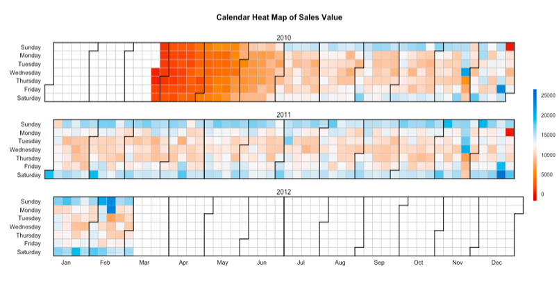
A calendar heat map is a graphical representation that can visualize values over days in a calendar. Moreover, using this heat map allowed us to see the overall pattern in the data set. In this graph, our group used red color to represent the days that had a high sales value, and used blue to represent the days that had a low sales value.
Weekly pattern of sales value
- Customers usually go shopping on the weekend.
Daily pattern of sales value
- The customers spent more money on some special days. For example, the customers spent a lot of money at this grocery store on the days before Thanksgiving and Christmas Day.
Ideas for further exploration
- Sales could be plotted against the volume of items sold to see if some days sell more expensive products
Department and Product Buying Associations
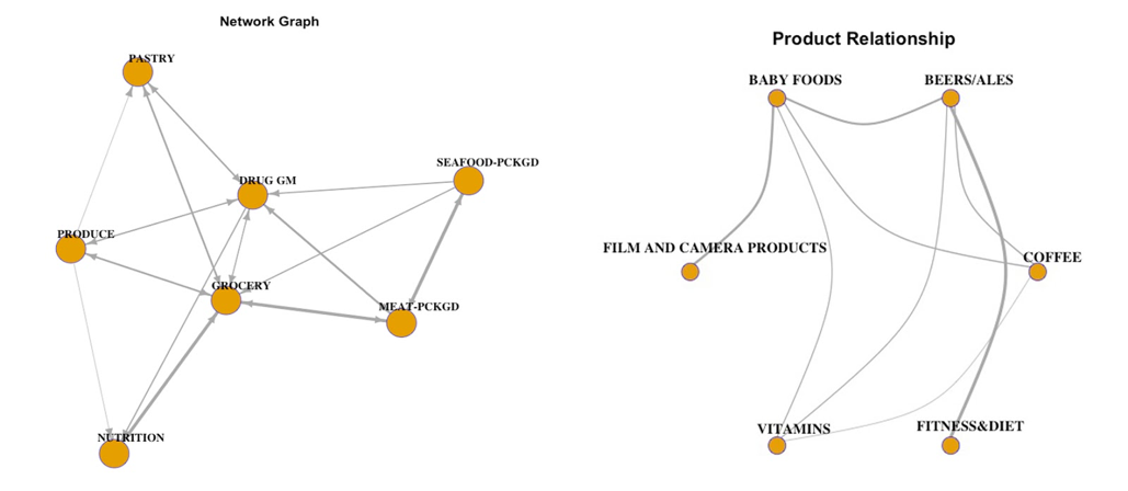
Network graphs revealed the relationships between different departments and product categories. With this plot, we used lines with direction, and combined the thickness of lines to represent relationships between collections of data (departments/products) that related to buyers’ habits.
Department patterns
-
Grocery is the main department that customers always shop.
-
The top three department pairs that have the most shopper traffic are Grocery:Nutrition, Grocery:Meat-Packaged and Meat-Packaged:Seafood-Packaged.
Product relationships
-
Shoppers who have a baby are most likely to buy film/camera products and beer, rather than vitamins.
-
Customers who usually buy fitness/diet products tend to pick up beers/ales, as well.
-
The most coffee buyers possibly have a baby (from the thickness of coffee’s edge lines).
Ideas for further exploration
-
Network maps could be constructed for different stores to see if similar products are purchased together across all stores.
-
Customers could be segmented by age, with a separate network graph for each. This would enable us to see if buying habits change with age.
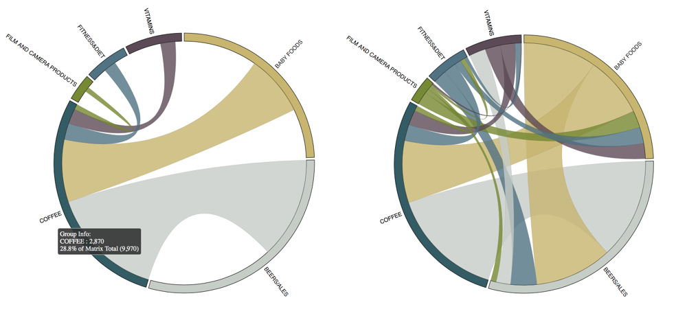
We used chord diagram as an alternative beyond network graph to display inter-relationships among the products in the grocery data set. Each product is divided and represented on the edge of a circle with different colors. This chord diagram was developed by D3. One important advantage of using D3 is that it is an interactive webpage. It also allows you to hover the mouse over the products to show the inter-relationship of each product. Coffee for example, you will see multiple lines with different colors and thickness clearly show the relationships between coffee and another product.
Link for chord diagram
- http://demo.lanbig.com/CSC465/d3-chord-diagrams-master/pro.html
- http://demo.lanbig.com/CSC465/d3-chord-diagrams-master/dep.html
Product relationships
- Customers are most likely buy coffee with beers/ ales, and least likely to buy with film and camera products. People who have a baby are more likely to buy baby foods with beers/ ales and coffee
Ideas for further exploration
- All products could be added to the chord diagram and should be divided by department and arranged until the final diagram is not too crowded.
One last thing..
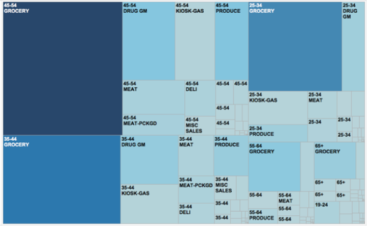
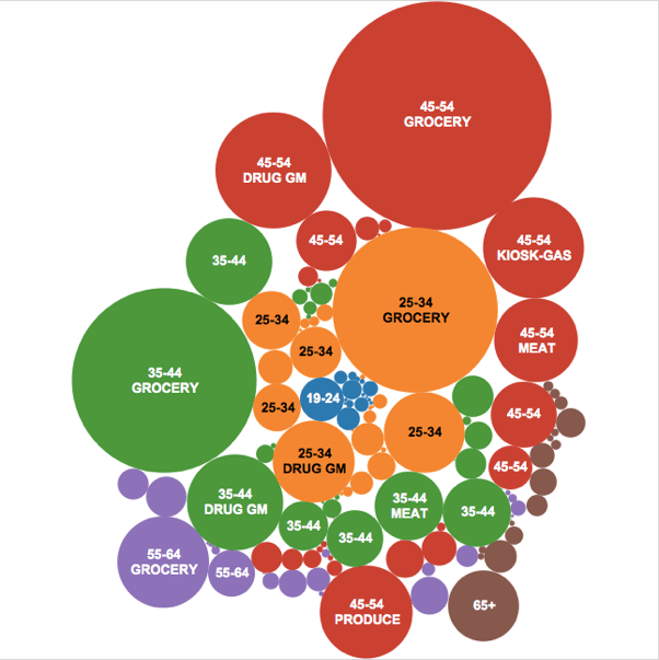
Tree map and Bubble plot
This tree map sought to explore the customer age and what type of products that customs were more likely to purchase at the store. This graph can help the store target their customers more effectively. Size shows sum of sales value. Color shows the number of coupons applied to the product departments. The marks are labeled by customers age and product departments.